![]()
The Cleveland Browns didn't exactly blow people away when they unveiled the team's new logo this week.
Basically, the Browns helmet logo went from orange to bright orange and they also changed the color on their face mask from grey to brown.
Whoa, the Browns got CRAZY with their new logo. pic.twitter.com/sBwoLS3u7X
— CBS Sports (@CBSSports) February 24, 2015
Most people on the Internet reacted in one of two ways to the Browns new logo: They either really hated it or they were confused by it.
The browns unveiling a new logo that looks basically the exact same way the old one does is such a browns thing to do
— Jake Smith (@ItsTheJakeMan) February 24, 2015
The Browns didn't do anything crazy with their logo, but teams have gotten crazy before when changing their logo -- and for proof, here's five of the most dramatic logo changes in NFL history.
Since we're talking about the Browns, let's start with them.
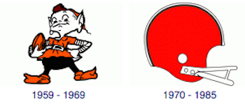
1. Cleveland. For 21 years (1948-1969), the Browns primary logo looked like a crazy, distant cousin of a Keebler Elf. However, after the 1969 season, the team decided to dump Brownie the Elf and go with a helmet.
Although Brownie is no longer the team's primary logo, he hasn't completely disappeared. You can still see him prancing around at Browns' home games.
2. Cincinnati. The Browns weren't the only team to make a change after the 1969 season, so did the Bengals. For the first two years of their existence, the Bengals primary logo was a tiger running with a football, which is a good logo because nothing is more terrifying than a tiger running with a football. However, after the 1969 season, the Bengals dumped the tiger as their primary logo and went with the boring helmet you see below.
3. San Francisco. Before making changing their logo in 1968, the 49ers utilized an actual 49er as their primary logo. The 49er you see below is carrying two pistols and kind of looks like he maybe spent some time in jail, so it's probably a good thing San Francisco decided to change its logo.
4. Tampa Bay. After the 1996 season, the Buccaneers decided to dump Bucco Bruce and go with a flag. From an intimidation standpoint, the flag is the better logo. From all other standpoints, Bucco Bruce is better.
5. Kansas City. So the Chiefs decided to change their primary logo after the 1971 season. That was probably for the best because I'm guessing the logo below wouldn't fly today.
Keep in mind that except for Kansas City, the logo you see above isn't the most current logo for each team. To see each teams' current logo, you can head over to sportslogos.net's NFL page here.