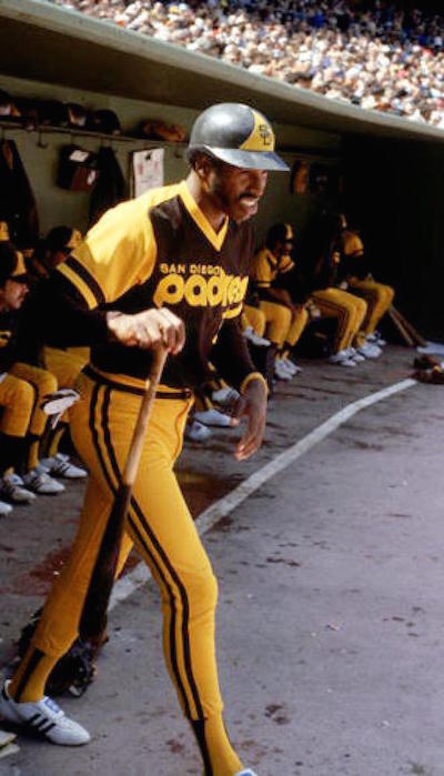
Time was when the Padres, as the controlling powers of the universe intended, looked like tacos or, if you prefer, a leather jacket on fire. Take it away, Dave Winfield, who was presumably through with it before you knew what to do with it ...
No more, though. These days they look like, well, the least imaginative components of 10 or 12 other MLB uniforms. Might that change, though? GM A.J. Preller has been busy remaking the roster, so a new look -- one in keeping with the franchise's origins -- is in order.
Of late, there's been an objectively right-wise and proper movement afoot to "bring back the brown" to the Padres. Now, a So-Cal visual artist (and Pads fan) named John Brubaker has put images to the ideas. Please regard ...
New-Look Padres, Back in Brown. http://t.co/7GZVRYMZil @Padres @PadresMikeDee @gaslampball @LobShots pic.twitter.com/zEuYJmR78F
— John Brubaker (@johnbrubaker) January 8, 2015
Click on each image to enlarge. Look at Matt Kemp!
Know what? I hereby declare -- from on high and while wearing a magistrate's wig -- that you're not allowed to dislike these. They incorporate the Padres' actual colors, and they do so while avoiding the gauche nature of the original article (I happen to adore the original article, but the gaucheness of same is self-evident). These are very simply nifty threads. They're classic-looking baseball designs that look like the Padres should look.
Well done, Mr. Brubaker. Now get this done, Padres. That's an order. #MagistratesWig